
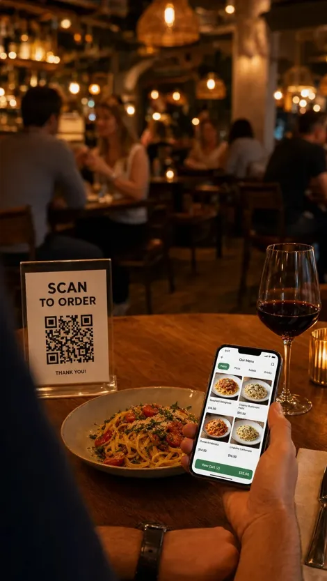
A restaurant menu shapes the customer experience before an order reaches the kitchen. It explains the food, supports purchasing decisions, sets price expectations, and communicates the restaurant’s identity. A weak menu can create confusion even when the food and service are excellent.
The operational impact can also be significant. A 40-table restaurant that serves two parties per table during one service may handle 80 menu presentations. Across five busy services, that can mean 400 printed-menu handoffs, checks, and cleaning cycles. A digital menu can reduce this physical work while giving customers faster access to accurate information.
However, placing a printed menu on a screen does not solve every problem. Customers still need clear categories, useful descriptions, readable prices, and a simple path to ordering. A practical digital menu combines good information, reliable technology, and a human-first design.
Why a Digital Menu Needs a Clear Purpose
Many restaurants adopt digital menus because the format appears modern or convenient. The result often copies every page of the printed menu without considering how people use a phone. Customers may face long blocks of text, small images, unclear categories, and repeated scrolling.
For example, a customer who wants a vegetarian main dish may need to open several sections and read every description. Another customer may want to check allergens but cannot find a clear ingredient note. These small problems increase decision time and create more questions for staff.
A restaurant benefits when it defines the menu’s main purpose before changing the format. Your primary goal may be faster table service, easier price updates, better allergen communication, more takeaway orders, or stronger promotion of profitable dishes. One clear goal gives the project a practical direction.
You can define that goal with a simple statement. A useful statement might be, “The digital menu should help dine-in customers find a suitable meal within two minutes.” Another could be, “The menu should reduce staff questions about ingredients and dietary options.”
This approach works because it creates a standard for every design decision. If a feature does not support the main goal, it may not deserve space on the menu. The final product stays focused instead of becoming a collection of unrelated options.
How a QR Menu Can Improve the Customer Experience
Customers often value speed at the start of a restaurant visit. They want to sit down, understand the available choices, and decide without waiting for a printed menu. A digital menu can support that process when access is simple and the information appears quickly.
A well-planned QR Menu gives customers direct access to current dishes, prices, ingredients, and dietary notes from their own phones. This format can also help a restaurant update unavailable items before service, which prevents customers from choosing a dish that the kitchen cannot provide.
Consider a lunch venue that changes two specials each day. A printed process may require new sheets, manual inserts, or verbal explanations from every server. A digital version can present the current specials in one visible section and remove them when they sell out.
The practical setup starts with placement and testing. A code can appear near the table edge, on a small table card, at the entrance, and beside the collection point for takeaway orders. Each location should provide enough light and empty space around the code for reliable scanning.
The page should then open the menu directly. Customers should not need to download an application, create an account, or enter personal details before viewing food options. Fewer access steps work better because each extra step gives the customer another reason to stop.
A printed alternative should remain available for guests who cannot or prefer not to use a phone. This choice supports accessibility and keeps the service human-first. Digital access should expand customer options rather than remove personal assistance.
Organize Categories Around Customer Decisions
Restaurant teams often arrange menus according to internal kitchen systems. The structure may reflect preparation stations, supplier groups, or accounting categories. Customers rarely think in the same way.
For example, a kitchen may separate grilled vegetables, fried items, and cold dishes because different stations prepare them. A customer may simply want a light starter, a meal suitable for children, or a dairy-free option. If the menu follows only the kitchen’s structure, the customer must translate internal categories into a personal decision.
Clear categories reduce this effort. Common labels such as “Starters,” “Main Dishes,” “Sides,” “Desserts,” and “Drinks” work because customers understand them quickly. A restaurant with a focused concept can use more specific labels, but each category should still describe what the customer will find.
Category size also matters. A section with 25 items can feel difficult to review on a small screen. You can divide a large section into useful groups such as meat dishes, seafood dishes, plant-based dishes, and meals for children. This structure works because customers can ignore groups that do not match their needs.
The most popular categories should appear near the top. Seasonal promotions or high-margin specials can receive a visible position, but they should not block access to the full menu. Promotion works best when it supports the customer’s task instead of interrupting it.
Write Descriptions That Answer Real Questions
A dish name may sound appealing to the restaurant team because staff members already know the recipe. A new customer has no such context. Names such as “House Bowl” or “Chef’s Special” provide little useful information by themselves.
Customers usually want to know the main ingredients, cooking method, portion style, flavor, and included sides. They may also need information about allergens or dietary suitability. If the description hides these details, customers may ask staff for help or avoid the dish.
A practical description can follow a consistent pattern:
- Main ingredient
- Cooking method
- Key flavor or sauce
- Included side
- Relevant dietary or allergen note
For example, “Chicken Plate” gives the customer limited guidance. “Grilled chicken breast with lemon herb sauce, roasted potatoes, and a seasonal salad” creates a clearer picture. The second version supports a faster and more confident decision because it explains what the customer will receive.
Descriptions should remain factual. Words such as “best,” “perfect,” and “unforgettable” make large promises without giving useful details. Specific information builds more trust than exaggerated praise.
You can also ask servers which questions customers repeat most often. If guests regularly ask whether a sauce contains nuts or whether a side comes with the meal, the menu description should answer that question. This method works because it uses real service data rather than assumptions.
Present Prices and Optional Extras Clearly
Unexpected charges damage trust. A customer may choose a meal based on the displayed price and later discover that a required side, sauce, or service item costs extra. Even a small difference can make the menu feel unclear.
Digital menus sometimes create this problem through hidden option lists. A burger may show one price, but the ordering screen may require the customer to select a paid side before continuing. A drink may appear affordable until size and flavor charges are added.
The displayed information should show what the base price includes. Optional extras should have visible prices before the customer reaches the final order stage. If a choice changes the total, the menu should explain that change beside the option.
For example:
- Grilled vegetable wrap with salad: $12
- Add roasted potatoes: $3
- Add plant-based protein: $4
- Add soup: $5
This structure works because customers can calculate the likely total while they compare dishes. It also reduces disputes and repeated questions at payment.
A restaurant should review every modifier from the customer’s point of view. Required choices, optional additions, and substitutions need different labels. Clear labels protect trust and help staff process orders correctly.
Use Food Images With a Specific Purpose
Images can help customers understand portion style, presentation, and ingredients. They can also make a menu slower and harder to scan. A page filled with large files may load poorly on a weak mobile connection, while inconsistent photos can lower confidence in the food.
A common problem appears when one dish has a polished image and the next five dishes have no image. Customers may assume that the photographed dish receives special attention or that the missing dishes are less important. Another problem appears when an image shows garnishes or sides that are not included.
A practical image policy gives every photo a clear role. Images may support signature dishes, unfamiliar foods, seasonal items, or meals with a distinctive presentation. A restaurant does not need a photo for every item.
Each image should match the current portion and ingredients. Similar lighting, background, angle, and crop create a consistent visual style. Accurate images work because they set realistic expectations and reduce disappointment when the meal arrives.
Image files should also remain small enough for mobile use. Compression can reduce loading time without making the food look poor. Staff can test the menu using a mobile data connection rather than relying only on fast workplace internet.
Make Dietary and Allergen Information Easy to Verify
Dietary symbols can help customers scan a menu, but unclear symbols create risk. A green leaf may mean vegetarian, plant-based, organic, or simply a popular choice. Customers should not need to guess.
Allergen information also requires careful handling because recipes and suppliers can change. A dish that normally contains no nuts may still face cross-contact in a shared preparation area. A digital label should support an informed conversation, not replace staff knowledge.
The menu can use written labels such as “vegetarian,” “plant-based,” “contains dairy,” or “contains nuts.” If icons are used, a visible key should explain each one. Plain language works because customers can understand it without learning a custom symbol system.
Your restaurant can create a review routine for ingredient information. The chef or kitchen manager can verify the menu after any recipe, supplier, garnish, or sauce change. Front-of-house staff should receive the same update so the menu and spoken guidance remain consistent.
A short note can also explain that customers with severe allergies should speak with staff. This note supports transparency while recognizing that preparation areas may present cross-contact risks.
Test the Menu During a Real Service Journey
A menu can look clear on an office computer and still fail at a table. Lighting, screen size, internet speed, camera quality, and customer familiarity all affect the experience. Testing should therefore reflect actual use.
A useful test begins at the restaurant entrance and follows the full customer journey. A tester can sit at a table, locate the code, scan it, find a suitable dish, review its price, check dietary information, and return to the main category list. The process should feel clear without staff explanation.
The test should include several types of customers and devices. A first-time visitor may notice unclear labels that regular guests ignore. A person with limited vision may identify small text or weak color contrast. An older phone may reveal slow images or buttons that are difficult to select.
Staff observations also provide useful evidence. Servers can record repeated questions, scanning failures, and dishes that customers struggle to find. A short weekly review can turn these observations into menu changes.
This process works because real behavior exposes problems that design discussions often miss. A menu becomes more effective through small, regular improvements rather than one large launch.
Track Results Without Losing the Human-First Focus
Digital systems can produce many measurements, but more data does not always create better decisions. A restaurant may track page views, clicks, time on page, category visits, and item selections without knowing which numbers affect service or sales.
The most useful measures connect directly to the menu’s original goal. If the goal is faster ordering, the restaurant can compare the time between seating and order placement. If the goal is fewer ingredient questions, staff can record how often customers request clarification.
Other practical measures may include:
- Scans per table or service period
- Views of featured dishes
- Orders of promoted items
- Questions about prices or ingredients
- Reports of scanning or loading problems
- Requests for printed menus
A low scan rate does not always mean the system has failed. The code may be hard to see, customers may prefer staff interaction, or printed menus may already be on the table. Numbers need context from staff and customer feedback.
A monthly review can focus on two or three clear findings. The restaurant can adjust one category, rewrite several descriptions, or improve code placement. Small tests work because the team can identify which change produced the result.
The final standard should remain simple: the menu should help real people choose food with confidence. Search visibility, digital features, and operational data can support that standard, but they should never make the customer experience less clear or less personal.
